Monday, June 16, 2008

Two Chelsea Shows


Saw two interesting shows on Friday.

First, a show of Burt Barr’s videos at Sikkema Jenkins. I had never heard of Barr, but he’s had solo shows at the Whitney and PS1. Somehow, he’s been off of my radar, though.

The show is quite still and not noisy (aside from gun shots – but they’re soft). There are a few projections of continuous loops - for example a frog swimming in place or a two channel piece with a donkey's face in a thunderstorm - and one piece on a monitor. Everything is black and white, and feels like moving photographs. This is how I like my video – pretty much uneventful. I hate when I walk into a long narrative piece and am under the impression that I’ve missed something very important.

Then at Perry Rubenstein, there are small scale, luminous paintings by Gabi Hamm that have an old-master-technique meets contemporary-subject-with-a-tinge-of-morbidness feel. I recommend.

Friday, June 13, 2008

Wednesday, June 11, 2008


I think it’s fair to say that art is only relevant, even only important, in context.

Nothing seemed more absurd to me than contemporary art in Mexico. When I found myself alone on the beach, or on a dirt road in the jungle, or in a village of cabaƱas that are probably $20 / month to rent, Damien Hirst’s diamond skull and the like seemed utterly pointless. Totally uninteresting.

But, today, back at the gym, back to running around like a chicken without a head, I was glued to Roberta Smith’s rave review of the Lichtenstein show at Gagosian uptown.

So, art has no intrinsic, fixed value. And I’d even say, art is of no value at all except to the artist or the art enthusiast.

Sunday, June 8, 2008

Wednesday, June 4, 2008

Susan Meiselas

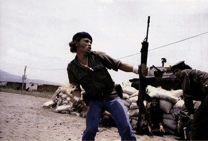
This past weekend, I worked on a transcription of an interview with Susan Meiselas for an upcoming show at the ICP. I've always associated her name with Nicaragua, and especially the picture of a Sandinista getting ready to hurl a Molotov Cocktail.

It’s so energizing when an artist actually has something to say because she does things (as opposed to an artist who has something to say because she’s thinking in her studio). And if this artist is also articulate, you’ve hit a jackpot. I’m especially excited to see images from Carnival Strippers, a project she worked on between 1972 and 1975. She went in and out of the dressing room to produce images, interviews and a book. From what I’ve seen, the images are sensual, cinematic and, best of all, off the soap box.

Monday, June 2, 2008

More on Words


Now, I’ve done no research on this but…

When Annie Sullivan, Helen Keller’s teacher, was able to make her student understand that the patterns she was signing on her hand corresponded to things around her – she might, for example, pass her hand under water, and then sign “water” on her hand, over and over again – Keller’s world opened up. Language and words, connected her to the world, it broke her out of her isolation.

On the other hand, words are also binding. For example, the women in Jean-Luc Godard’s Two or Three Things I Know About Her repeatedly demonstrate that our words confine our view of the world, assign it a biased value. It might be as simple as calling something a woman, or a shirt blue that bounds our perspective. In this sense, it is politically liberating to break from these codes.

Are these contradictory experiences?

Wednesday, May 28, 2008

Words are punny


John Wilkes Booth, 1987

I’ve seen only one Kay Rosen piece in a gallery, and I thought it was ho-hum; a drawing that read “swords” with the s written differently.

But, I am attracted to photographs of her wall texts and paintings. Partly because I get them - and that always makes me feel smart - and partly because I enjoy their graphic quality. They’re simple, at best deceivingly, at worst overly.

From what I gather, she’s playing with the contrast between reading and seeing. The work depends on the tension between what happens visually - by mirroring words, juggling letters, or repeating - and what the words represent when read.

If you wanted to get heady about it, you could just turn to Julie Kristeva. “[The work is] presyntactical and prelogical …[in] a verbal code dominated by the two axes of metaphor and metonymy.”

But, what I enjoy about it all is that it's immediately un-heady.

Hello Again, 2006

Monday, May 26, 2008

Kind of like the Bunkers


From a single column in a profile of Paul Chan by Calvin Tomkins in last week’s New Yorker:

[Happiness] was the first piece of Chan’s to appear in an art gallery, and several reviewers took notice. Roberta Smith, in the Times called it “a brilliantly imagined work.” […] “My birds” drew respectful, though not ecstatic, reviews when it was shown at Greene Naftali in 2004. Jerry Saltz, in the Village Voice, praised the work’s “extravagant eye-popping color;” […] Carol Greene had no trouble placing all five editions of the new work in major collections, however; there is a deep emotional undercurrent to Chan’s videos, a sense of longing and even pain which is strangely moving. “Whatever he does is charged,” the artist Rachel Harrison, who has known Chan since 2002, said. “It feels like it’s exploding.”


Just a reminder:

Roberta Smith and Jerry Saltz are married.
Greene Naftali(Carol Greene’s gallery) is a blue-chip Chelsea gallery, the kind most often reviewed in both the Times and the New Yorker.
Rachel Harrison also shows at Green Naftali.

So, all these serious commentators are really all in the family.

Gross or just the way of the world? Both.

Wednesday, May 21, 2008

Green


This is my confession: I’m never more in touch with jealousy than when I’m wearing my artist hat.

Last week, a photographer I used to work for got a glowing review in the New Yorker. Her new body was called her “masterpiece.” But I was practically seething.

Then a very good friend had his first solo show open. He wrote to me about how well attended it was, about how many compliments he received. I am very well-trained – and I really wouldn’t have wanted it to be otherwise - but I had to muster up congratulations.

One of this blog’s few readers – Mike – had a successful open studio weekend and even that stirred up the juices.

I couldn’t even go to the Chelsea opening of a fellow grad school student.

Here’s a good one: a dead guy. I’m translating the brochure for his retrospective at the Jeu de Pomme in Paris. Tell me, are so many superlatives really necessary?

It all boils down to this fine phrase:

What am I, chopped liver?

Monday, May 19, 2008

Pronounced ROO-SHAY


In Ed Ruscha’s most familiar words paintings, he turns words into objects. They are given a scale, sometimes in comparison to an object, they are given weight too. Often he creates conflicts between the word, the color, what it’s compared to, a paradox that is two-fold because these word-objects are, in fact, but painted illusions.

What the words say don’t reference high culture, they’re more common words, expressions, conversational utterances that he plucks from his diaries. This may be part of the reason why he's sometimes called a Pop artist.

In a1973 interview, Howardena Pindell asks,“Why are you attracted to words like “Annie,” “carp,” “lisp,””sing?“

Ruscha responds:

Because I love the language. Words have temperatures to me. When they reach a certain point and become hot words, then they appeal to me. “Synthetic” is a very hot word. Sometimes I have a dream that if a word gets too hot and too appealing, it will boil apart, and I won’t be able to red or think of it. Usually I catch them before they get too hot. I have, though, caught words in the dictionary instead of had them come to me via flashes.


All this makes the work sound easy. It’s not. I never can say I really get a piece.

For example, the more recent mountain series (Above, The Mountain, 1998). Wha???

Wednesday, May 14, 2008

"Words are only painted fire: a look is the fire itself" Mark Twain


I’ve been compiling a list of artists who use text as form and content. Here’s who I’ve come up with. Am I missing anyone?

In no particular order:

Ed Ruscha
Christopher Wool
Richard Prince (jokes)
Jenny Holzer
Barbara Kruger
Mel Bochner
Glen Ligon
Kay Rosen
Bruce Nauman
Sean Landers
Robert Indiana
Lawrence Weiner
Jasper Johns


Today, I’m thinking about Christopher Wool, whom I actually know very little about. I saw a show of his curvy, graffiti-like abstractions a few years back and hated it. I thought the paintings were superficial updates of abstract expressionism and that seemed arrogant, easy to me. A show of similar work is up now at Luhring Augustine and I’d like to reconsider, though. Because I’m really attracted to photographs I’ve seen of his text paintings.

They’re large bold stencils. The words and phrases are urban and tough, but not without ambivalence and insecurity. For example, “FOOL,” “HOLE IN YOUR HEAD” and “FUCK EM IF THEY CAN’T TAKE A JOKE.“ They look good.

Dave Hickey wrote a notoriously scathing review of his work in 1998, calling it “upscale down market” and “designer-punk agitprop.” I do see what he means. The above painting is seen installed in a Beverly Hills home.

But I would say contemporary art is elitist. There’s nothing we can do about that. The question really is, does the art strike a chord in you. And, more importantly, does it do so sincerely, not through effect but through complexity. Although, my jury is still out, I’d say these text paintings do.

Monday, May 12, 2008

The Male Gaze


Maria, 1996. Courtesy of Janet Borden, Inc.

Lee Friedlander photographs and photographs and photographs. Trees, the American landscape, musicians, flower stems. And his family. This ongoing series is perhaps my favorite because of the tenderness that comes through in each image. That’s his wife above with the smiling cat. I never thought neck lines could look so good, so right. It is because they are loved.

The self-portrait below with his wife again remains one of my favorite pictures of a couple ever. Her soft smile, his gentle lean, both ooze admiration. It’s what most people have in mind when they get married.

An exhibition of Friedlander’s square portraits are on view at Janet Borden through June 7.


Cannon Beach, Oregon, 1997. Courtesy of Molly's bookshelf.

Wednesday, May 7, 2008

ode to the 8 x 10, but not to the jpeg


I am not an Andreas Gursky fan. And that’s putting it mildly. Because of him, photographs have to be fifteen feet wide now. And because of him, we forget that real detail and landscape – not created– is fascinating and beautiful. Even more, in fact.

It is thanks to scale and detail that Sze Tsung Leong’s show at Yossi Milo, up through May 17, sucked me right in. The series on view, Horizons, presents broad landscapes from across the globe, from heaving cityscapes and mountains of homes (and you can see every window), to apocalyptic deserts. The images measure 14” x 24” each and are installed side by side, creating the illusion of a continuous line.

Above, Dubai (2007) followed by Jersey City (2002).

It’s easy to believe that we dominate our surroundings, that we create the world we live in. But, spend a little time with these images, and you’ll remember that our environments are the most unusual sets and that at any moment these places we call home might be razed or drowned or blown apart. In his previous series, History Images, Sze Tsung Leong shows us just this, in fact, by charting history in construction and over construction in China.

Below, Yihao Qiao, YuzhongDistrict, Chongqing, 2002.

Monday, May 5, 2008

Drawing the Line


I absolutely love to look at drawings because I love line work.

It is so difficult to make what I consider to be a true line, one that is not scrawled without attention – a fly away - and one that is not made with pretentious deliberation – a hip line, we could say.

What I look for in a line is a concentration that’s not too tight, not too loose. When I draw, I try – although try is really the wrong word – to keep my mind in the back seat, where it can watch the hand go, but not go haywire.

When I step back from a drawing, I can tell when the line is present or not on the page, a reflection, really, if I was present or not at the time. But sometimes the most present lines happen when I’m thinking about how much I hate when she said that, or when I’m wondering if it’s too early for lunch.

Sometimes you can give the impression of a true line through what I could grandiosely call expressionistic posturing. This is usually accomplished through the misuse of tools like partial erasing, texture, feathery back and forth, or pushing down really hard. The misuse is that they’re exploited as an effect. But, if you look, they’re just masking bad drawing.

I’m currently working on a series of drawings that uses text as form (I don’t mean writing the word “tree” in the shape of one, but more on this another time) and I’m running in to all these pitfalls, problems that I saw in the drawings that I posted and then un-posted last week.

My drawing hero is Philip Guston, of course. A show of his drawings are on view at the Morgan Library through August 31.