Wednesday, July 14, 2010

More good press for the Charles Burchfield show at the Whitney


(Charles Burchfield, Orion in December, 1959)

What impressed me most was not so much the oeuvre, but the way the show was designed and curated. It has the stamp of an artist. In this case, he’s Robert Gober.

Each room has its own atmosphere, its own communication. And the show as a whole is pared down. In one room, there are but two paintings, for example. This is what I aim for in a single drawing: a tightly communicated but complex image. I’ve learned that it can take a thousand to get there.

The work itself leaves me with mixed feelings. Some details and atmospheres are immediately entrancing; but there is also a very tight tie to the written word that feels a bit too literal or familiar to me. These images border on cliché: denuded trees, barren streets. I feel pulled to read the journals instead. But that said, who cares. I have no need for original subject. Really. And there’s so much to see here about being true to one's own work.

Monday, July 12, 2010

What's up in teen pop culture

(Still from "Waka, Waka")

Justin Bieber. Still.

And covers. For example, a “We are the World” remake but for Haiti. And who sings the opening line? Justin Bieber. What’s more, Michael Jackson was resurrected for the event to sing with his sister.

After rewatching the original (25 years ago?), I only have one word: Bruce.

Also popular among girls is a Mariah Carey version of the Foreigner staple from 1984 “I Want to Know What Love Is.” It’s absolutely terrible and the video will turn you into a Jihadist. Watching shiny Shakira smiling and shimmying “Waka Waka,” a song for Africa that capitalizes on the World Cup, comes practically as a relief. Practically.

Wednesday, July 7, 2010

Line vs. Color

(Henri Matisse, The Dessert: Harmony in Red, 1908)

I think it’s true. There are two teams, Line and Color. Sometimes they play together, sometimes they are opposing. But they are always distinct.

Yes, there can be a colored line, and there can be the line outlining a form, but the color of the form is neither of these.

Color is a surface, an expanse. Color takes up room. Line doesn’t fill like color.

Line can go on top of color. And color can go on top of line. But I can’t think of a visual representation of a merged thing called colorline.

The personality of a line is in it’s marking: a line can be flexible or stiff, fast or slow, premeditated or in the moment. The personality of color is in its hue, its intensity, its thereness. Line does and color is.

Color has mass appeal. Line takes some learning and is therefore more elitist.

How am I doing on the generalizations?

Wednesday, June 30, 2010

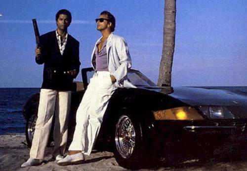
Just Vice, Not Miami Vice


I had a nice visit with a painter yesterday whose palette includes bright yellow and orange. She told me about a young curator who commented that her work was “so 80s, like Miami Vice.” The curator saw neon and thought Don Johnson?

I can only sneer at omnipresent, kneejerk comparisons to pop culture. What ever happened to references to art history, or psychology, or just something else other than TV? Of course, viewers are free to make their own associations, as are artists. The pool is very deep. But curators should really aim to broaden and expand notions of color, form and subject. My opinion.

And why does the fashion – literally the clothes – of these same curators have to be so referential too? The mega glasses and t-shirts with outdated puns look stupid. Also my opinion.

Monday, June 21, 2010

Not with a bang, but a whimper


(Derrick Adams, The Lieutenant, 2010, 63" x 24")

And so “Out of Line” closes at the end of the week. A year in the making, my expectations were high. I had hoped for sales (none so far), a visit from Roberta (I don’t even know if she got our invitations), a new “whooohooo” opportunity. But really, this show is just another step down the long road.

The coherence of the work in the exhibition, my talk, and all the other preparations did bear fruit. We had success, both public and private (personal encouragement, some new acquaintances, the New Yorker for example). But it’s a splash of cold water in the face to learn how much an artist can’t rely on the goodwill of any potential visitors or art-world professionals once the show is up. Really, if you want to make inroads in terms of making a public name or career for yourself, you’ve got to be alpha-male aggressive, opportunistic, even over-bearing. It's a slog. I can’t say that’s my cup of tea.

But, I do want to make work still, and that’s the only reason to stay in the game.

All you need is one partner to keep going.

Wednesday, June 16, 2010

Primitivism

(Huma Bhaba, Bumps in the Road, 2008)

Along with “physicality,” the buzzword of the moment (in art of course) seems to be “primitivism.” My BFF (and we haven’t even met yet) Christian Viveros-Fauné, uses it in his article in the Voice today.

"Homunculi" [the current show at Canada] introduces largely accomplished versions of a newly popular trend toward artistic primitivism.”

This term seems to describe art that displays a rawness of expression that is reminiscent or suggestive of either “primitive” cultures – like Africa? I thought we were over that designation – or that borrows from prehistoric peoples, or that is somehow naïve or outsider. I think I prefer the term rawness or intuitive, although that might be too psychological, and not ethnographic enough, if that matters.

An artist I know said this word was used to describe the work of Huma Bhabha. I dig her.

Wednesday, June 9, 2010

What (the hell) is Modernism?

(My friend visiting Out of Line)

There are words that are slewed through art circles without a care in the world. “Conceptual” used to be my pet-peeve. If someone says your piece is conceptual, it usually means they don’t get it. To me “conceptual” means work stemming from the Conceptual Art movement in the 60s. It doesn’t mean any piece that makes you think. Let’s move on.

Distopian and ontological. I’m not that interested in exploring these terms right now.

What I want to look at today is the word “Modernism.” There was a time when “modern art” meant “of our times” (Museum of Modern Art). Now we have the word “contemporary” for that. Today “Modernism” should really mean "of the period around the early twentieth century when breaking new ground away from tradition was a primary interest." I’m pretty sure Matisse, T.S Eliot, and Cubism are considered Modernists.

Then I hear “Modernist architecture.” This seems to be the embrace of “technology” in architecture in the 40s and 50s – is that right? - ,which yielded sleek design (the Seagram Building, for example). From our present-day perspective “Modernist architecture” is really retro architecture.

But then there’s “modernism” meaning "relating to self-consciousness and subjectivity." The Abstract Expressionists are modernists, for example. With the term “post-modernism,” the idea of the self became a thing of the past, because the self was deemed impossible to define narrowly (Hey, some people are black and some people are white). But I don't think "modernist" artists are trying to peg anything, really. The approach or filter is just the individual, as I see it.

Many theory-based artists and writers seem to have disdain for strains of modernism in contemporary art (thick paint, psychological bents, the human touch) because it somehow denies that there are systems in the world. Bah. You can favor the mark of the hand and know FedEx exists.

Readers: do I have most definitions of modernism covered here in the most cursory way?

Monday, June 7, 2010

Mini gallery crawl

(Tuckery Nichols, Untitled, 2010, shoe soles and wood, 3 x 3 x 3 inches)

Can’t wait to get back into the studio. What really matters in all of this is making I think. I just wouldn’t be able to keep up full time with the rest: the networking, the emails, the thanking, the making sure this, making sure that. I’m certainly not complaining about finally being at the beginning of an art career. It’s simply that it’s a lot of paperwork! And it’s very draining at times.

To refuel, viewing art helps.

I particularly liked Tucker Nichols’ refreshing show at ZieherSmith. While it could potentially come across as faux-naïve, the work feels unguarded and playful. Down the block, Josephine Meckseper’s installation at Elizabeth Dee feels the opposite: deliberate and cool, heady and insider.

Over on 22nd Street, a small show of Paul Bloodgood’s paintings at Newman Popiashvili is big. The press release indicates Bloodgood’s interest in how painting can veer from self-expression. It’s interesting to read about (if I understood it correctly), but when I look at his work – and perhaps at art in general - , I can’t help but think it just IS self-expressive. It has a human touch and that's what I like about it. And the rest is the rest.

Wednesday, June 2, 2010

Out of Line in the press


"Out of Line" is on the Short List in this week’s New Yorker in the Goings on About Town section! Whooooo! Oh, I mean, "I am so pleased."

This Saturday I will be giving an unconventional slide-presentation that will expand on the show.

The presentation is a subjective survey of what line is and has been in visual art and other domains, including sports, war, language and spiritual practice. I travel far and wide from Matisse to Charles Ray, from my bathroom calendar to a chorus line, from vectors to the most delicate grape leaf outlined by Ellsworth Kelly.

Please come.

June 5 at 5pm.
Slag Gallery
531 West 25th St., Ground 10

Wednesday, May 26, 2010

Things to Remember

(Claude Monet, Nymphéas, 1914-1917, oil on canvas, 59 x78 3/4 in.)

1. It’s art if you think it is.
2. In making art, you carry out your own vision, not anyone else’s. It’s more personal than showing your influences and it’s beyond trend. And this is easier said than done.
3. One truly like-minded friend goes a long way. Pollock and Krasner, Guston and Coolidge, Gilbert and George.
4. Lists are simplistic.
5. If you camp out at Monet in Chelsea, you will see lots of art world peeps who don’t answer your emails.

Monday, May 24, 2010

The Morning After


(Crowd shot from the opening of Out of Line)

Some people say, “Fantastic!”, “Love the work!”, “Like the direction you’re going in!”, “Cohesive show!”. But what I dwell on, what I stick to, is the negative. And it’s not even that negative. It’s just not positive, it’s lukewarm, like, “I generally liked it,” or “that’s not my favorite piece.” It might even just be the nebulous “Congratulations.” Then I start feeling my thyroids swell, as if someone were holding me by my neck up against a wall. I’m convinced I’ve done something wrong. Something very, very wrong. And that that one nonplussed comment means the whole endeavor is a bust. That I am a bust. I could spend my whole life trying to change that opinion.

But I digress. Showing art in public is a risk. You don’t show yourself perfectly and therefore you are vulnerable. In front of everybody. But you’ve also made a move, staked a position that can make an impression on a few others, and of course on your own self. I have to say, so far, all in all, this time around, it has been really quite heartwarming.

Wednesday, May 19, 2010

Installed and Looking Good


And maybe I can return to normal blogging soon.
Hope to see you at the opening or during the run of the show.

Wednesday, May 12, 2010